
Lisette Vredenburg
Product Owner
The power of vragen.ai lies in the insights it delivers. With the vragen.ai inbox, you could already see every question, including its exact phrasing and context. This gave you a clear picture of what is on your visitors' minds. However, as the volume of questions grows, identifying patterns becomes increasingly time-consuming. That is why there is now an automated overview: the Analysis.
Under the Analysis tab, you will find a clustered summary of all submitted questions. Clear charts show you what most questions are about and how visitors perceive the answers. This allows you to quickly identify where visitors are being helped effectively and where improvements can still be made.
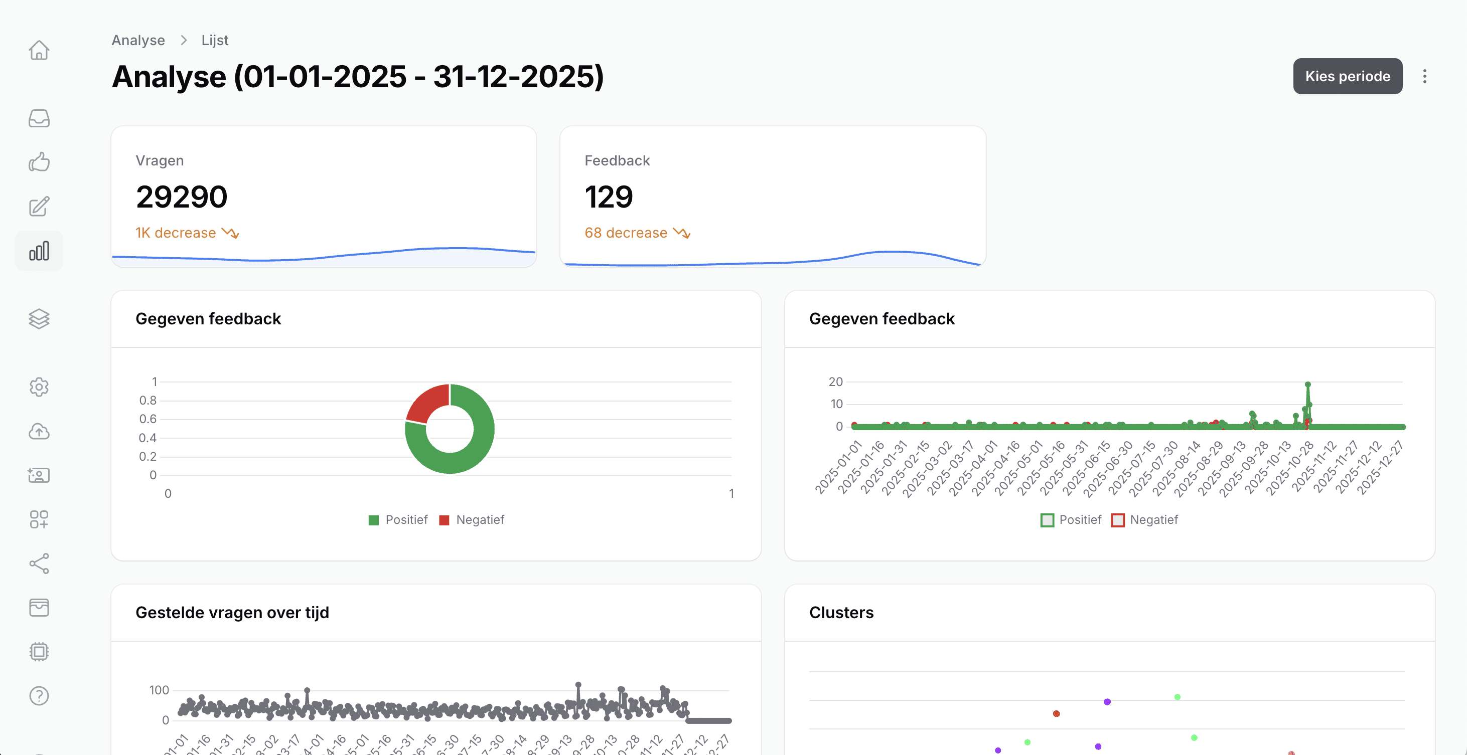
What do you see in the Analysis?
Select the period you want to analyze. You will then get insights into:
The number of questions asked, including a comparison with the previous period
User feedback, summarized in a clear pie chart
The progression of questions and feedback over time – ideal for identifying peak moments
Main clusters (distribution/size), to see where the majority of questions are concentrated
Content-based clusters/themes and their corresponding metrics
For each cluster, you can see:
The number of questions within the cluster
The amount of feedback submitted, both positive and negative
The average evaluation score: reliability, relevance, and source relevance
This helps you quickly discover which clusters perform well and which ones require extra attention.
Better control over content
Want to zoom in further? Simply click on a cluster to view the individual questions. This allows you to easily verify if the clustering makes sense and gives you a sharp understanding of the content within each theme.
Curious about your analysis? Go to your personal dashboard and try it out. We look forward to your feedback!

