Discover insights even faster: the new Analyze feature
Immediately see which themes are playing, how they are evaluated, and where opportunities lie.

Lisette Vredenburg
Product Owner
The strength of vragen.ai lies in the insights it provides. With the inbox of vragen.ai, you could already review every question, including the exact phrasing and context. This gave you a clear picture of what visitors are concerned about. But as the number of questions increases, it takes more and more time to recognize patterns. That is why there is now an automated overview: the Analysis.
Under the tab Analysis, you will find a clustered summary of all questions asked. In clear charts, you can see what most questions are about and how visitors experience the answers. This way, you recognize faster where visitors are well-assisted and where improvement is possible.
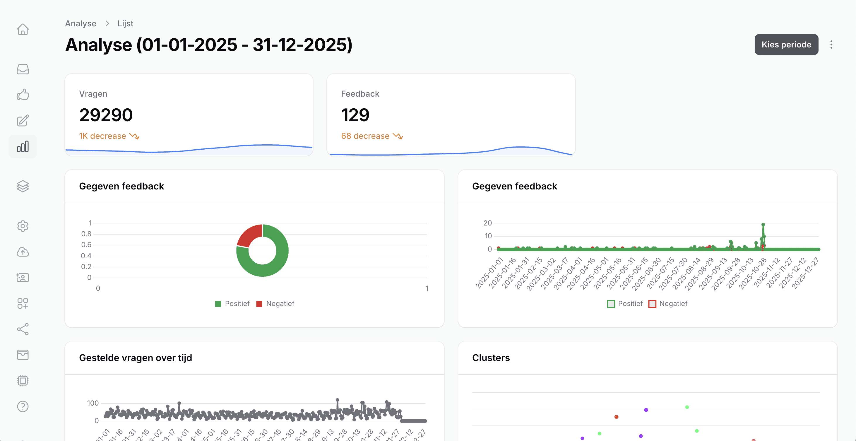
What do you see in the Analysis?
Select the period you want to analyze. Then you gain insight into;
The number of questions asked, including a comparison with the previous period
User feedback, summarized in a clear pie chart
The development of questions and feedback over time – useful for recognizing peak moments
Clusters in main lines (distribution/size), to see where most questions are.
Content clusters/topics and corresponding figures
Per cluster you will see:
The number of questions within the cluster
How much feedback has been given, both positive and negative
The average evaluation score: reliability, relevance, and source relevance
This way, you quickly discover which clusters score well and which need extra attention.
More control over the content
Want to zoom in further? Click through a cluster to view the individual questions. This way, you can easily check whether the clustering makes sense and get a clear picture of the content per theme.
Curious about your analysis? Go to your personal dashboard and try it out. We are looking forward to your feedback!
